Study Spotter

Full case

Full case

User research

UX/UI

Redesign

Design System

Role

Product Designer

UX Researcher

Team

Solo

Tools

Figma

Lucidchart

Illustrator

Timeline

2023: Jan 5 -21

Redesign

2024: Jan 10 - 31

Overview

Overview

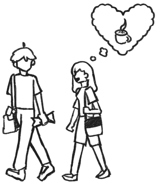
  • After class, Max & Sam decide to work at a cafe. Sam remembers a spot with a great matcha latte!

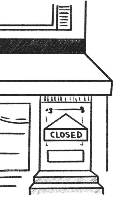
  • But as they turn the corner, they see that the cafe is closed.

  • “What kind of place closes on Wednesdays??” exclaims Sam in frustration.

  • After a few minutes of searching, they settle on a nearby place that’s still open.

  • They head over, trying not to waste any more time...

  • They finally arrive, order their drinks and set up when...

  • The dreaded no battery screen appears and to Max and Sam’s dismay, not an outlet in sight.

  • Defeated, the two return home to finish their project over Zoom.

How might we reduce the time and energy spent looking for places to do work to improve the experience of working outside of the home?

Highlights

Original

Centralized information

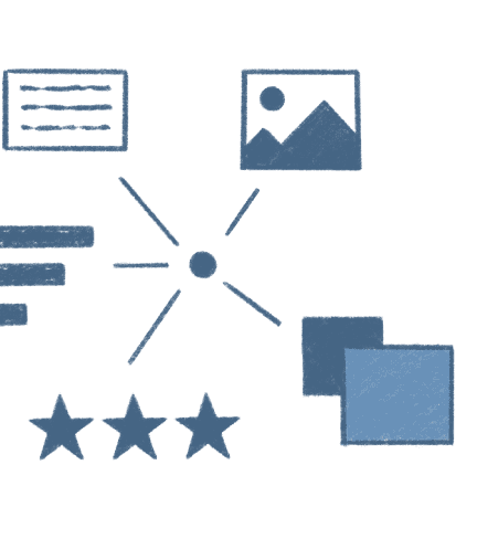
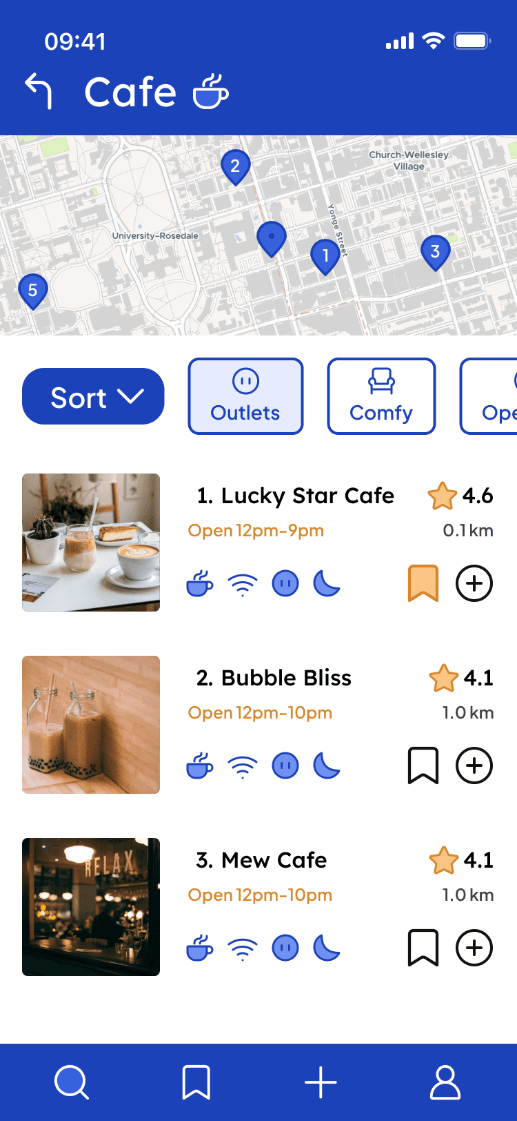
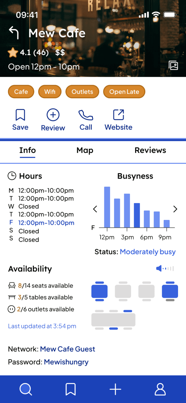
Consolidated information about study spots (location, Wi-Fi quality, seating availability, noise levels, and hours)

Double filters

Users can apply two layers of filters to refine their search results and find the best match based on their needs.

User reviews

Reviews including ratings and real experiences, helping new users gauge if a place suits their preferences.

Accessible design system

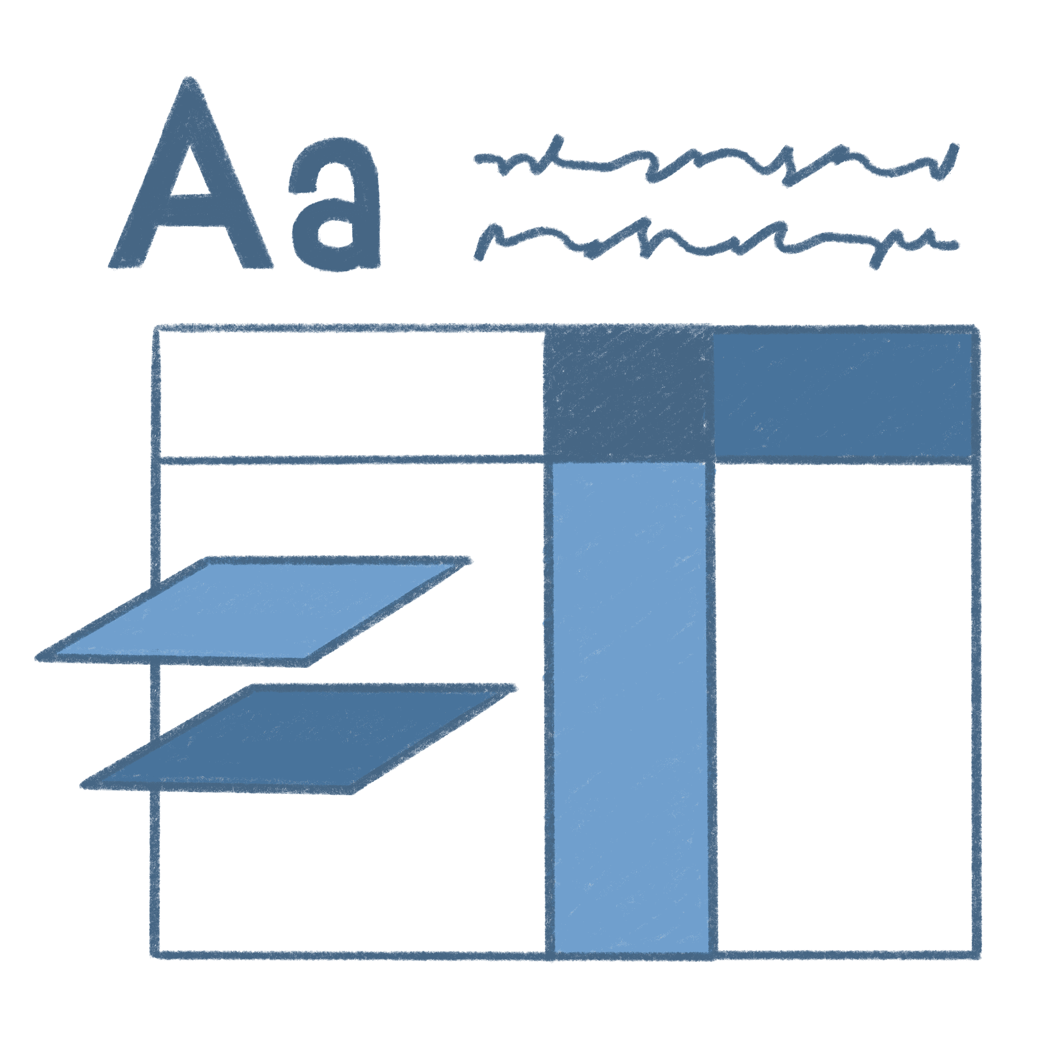
A new design system that adheres to accessibility guidelines (proper contrast, readable fonts).

Collection folders

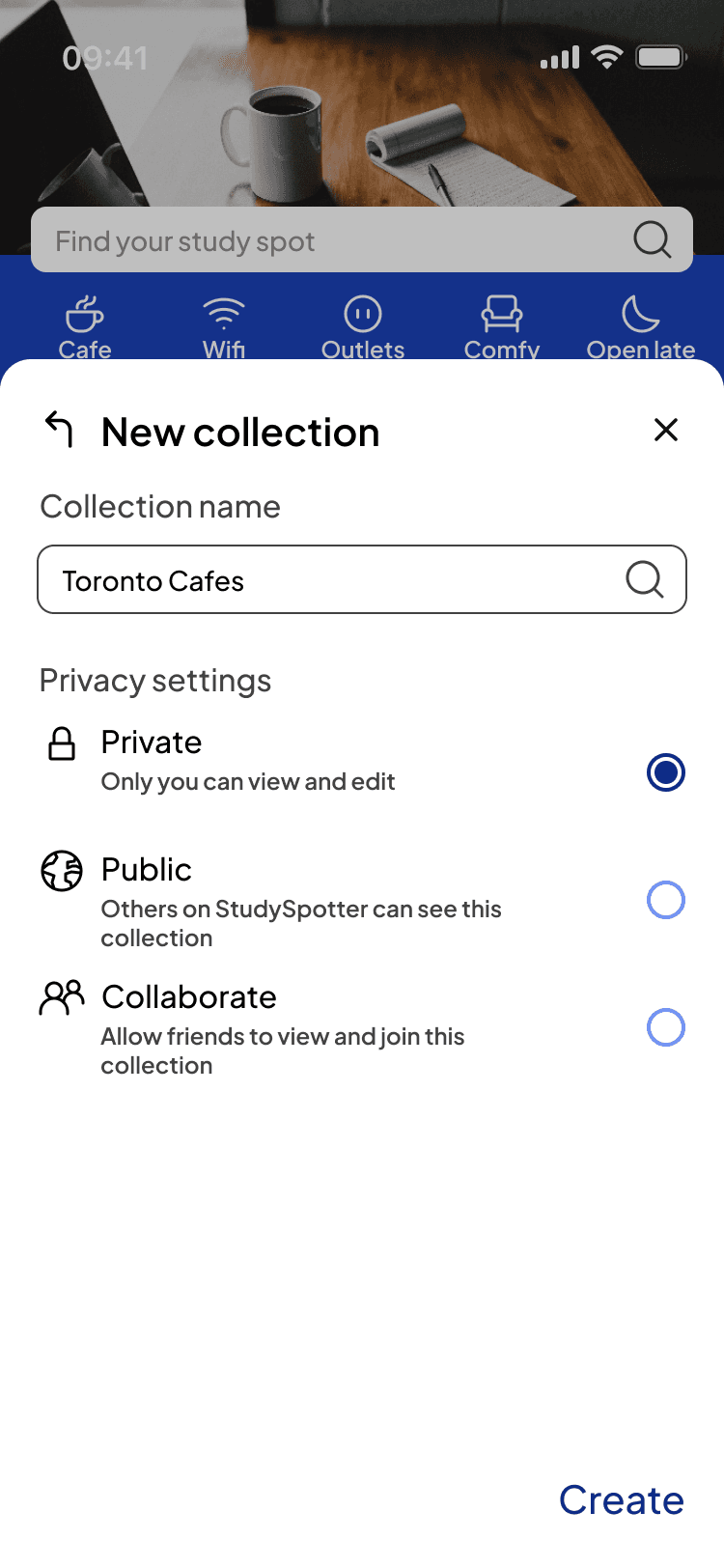
Users can create personalized folders to organize their favorite study spots.

Real-time updates

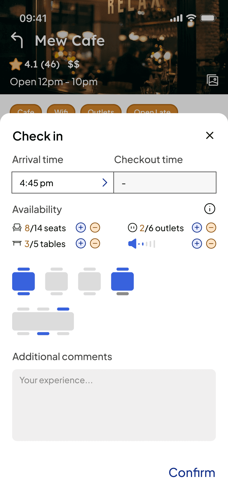
The ability to "check in" and "check out" of study spots, providing real-time updates on the spot’s availability.

Second Iteration

Highlights

Original

Centralized information

Consolidated information about study spots (location, Wi-Fi quality, seating availability, noise levels, and hours)

Double filters

Users can apply two layers of filters to refine their search results and find the best match based on their needs.

User reviews

Reviews including ratings and real experiences, helping new users gauge if a place suits their preferences.

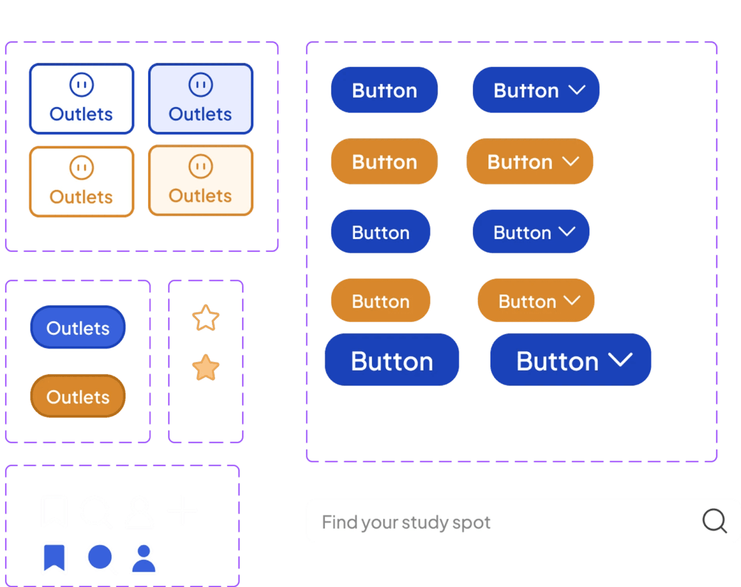
Accessible design system
Accessible
design system

A new design system that adheres to accessibility guidelines (proper contrast, readable fonts).

Collection folders

Users can create personalized folders to organize their favorite study spots.

Real-time updates

The ability to "check in" and "check out" of study spots, providing real-time updates on the spot’s availability.

Second Iteration

Original

Centralized information

Consolidated information about study spots (location, Wi-Fi quality, seating availability, noise levels, and hours)

Double filters

Users can apply two layers of filters to refine their search results and find the best match based on their needs.

User reviews

Reviews including ratings and real experiences, helping new users gauge if a place suits their preferences.

Highlights

Accessible design system

A new design system that adheres to accessibility guidelines (proper contrast, readable fonts).

Collection folders

Users can create personalized folders to organize their favorite study spots.

Real-time updates

The ability to "check in" and "check out" of study spots, providing real-time updates on the spot’s availability.

Second Iteration

Background

Background

In light of the COVID-19 outbreak, there has been a shift for students and adults toward studying and working outside rather than at home, particularly at cafes and libraries.

However many people have difficulty efficiently finding suitable study/work spots with the specific resources they require, especially when unfamiliar with the area.

70%

of students prefer online learning to the traditional in-class setting

70%

70%

of students prefer online learning to the traditional in-class setting

62%

of workers in 2022 enjoy the flexibility of choosing their work locations

36%

of workers in 2022 struggle to focus with distractions at home

36%

of workers in 2022 struggle to focus with distractions at home

36%

of workers in 2022 struggle to focus with distractions at home

People want to go out to work,

but finding your ideal spot is not always easy

By collecting 34 survey responses and conducting 8 interviews , I found that...

Surveys

64.7%

say they frequently or always do work outside of their home

94.2%

say their studying is moderately to heavily impacted by their environment

64.5%

find it moderately to extremely difficult to find study locations with all the factors that are important to them

User Interviews

Catering to User Needs

Catering to User Needs

After reviewing my findings, I was able to identify the key components of the problem and gained an overall better understanding of my target user.

I don’t want to keep switching tabs, I need a way to see information about these places all in one!

I have specific preferences and need a way to sort through all the information available.

I need information that is unbiased, accurate, and up to date.

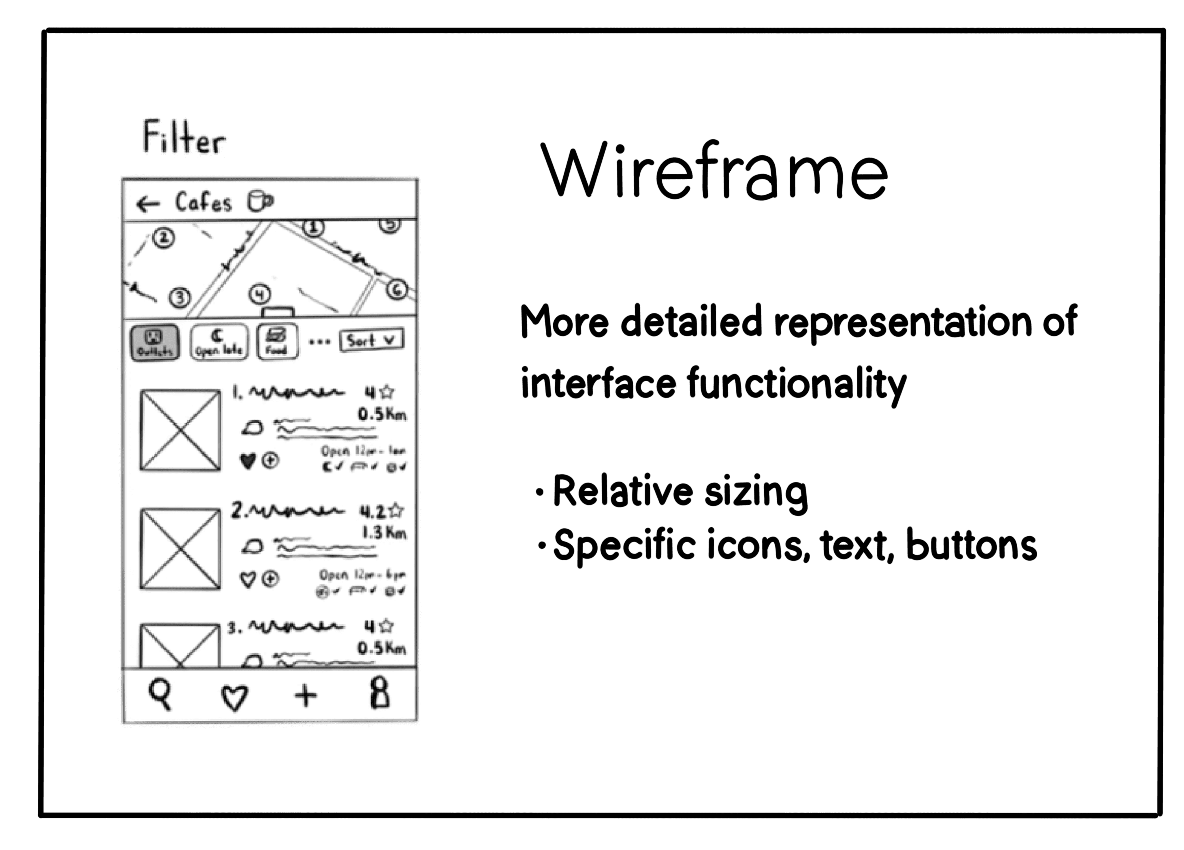
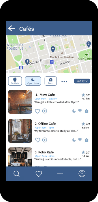
The iterative process...

The iterative process...

1st Iteration

Functional prototype with core features implemented


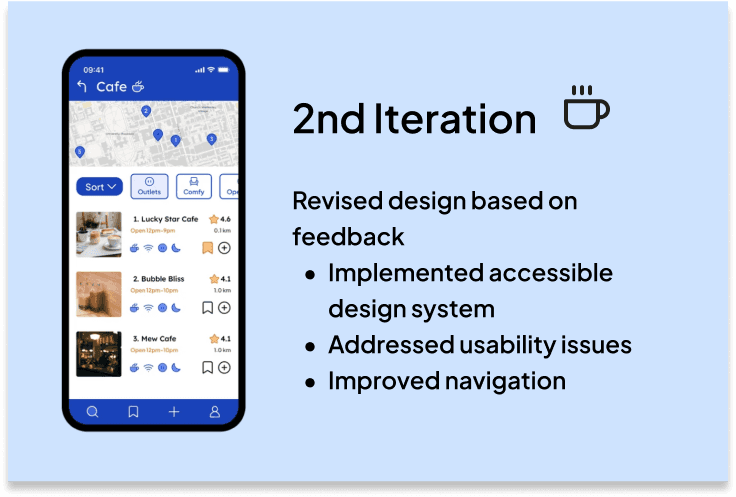
2nd Iteration

Revised design based on feedback

Implemented accessible design system

Addressed usability issues

Improved navigation

Users had a lot to say about the first iteration

Users had a lot to say about the first iteration

Users had a lot to say about the first iteration

Design System

How does it work?

How does it work?

I’m looking for a cafe with outlets...

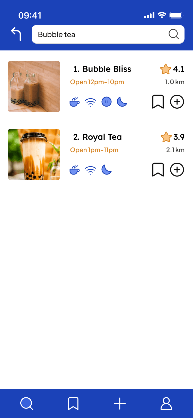
  • Home page

    Users can start with browsing to find popular study spots.

  • Double filter

    If users have specific features they’re looking for, they can filter.

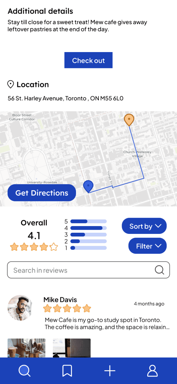
  • Business pages

    Information about the study spots can all be found on the business’ page. This includes seat availability, directions, and reviews from other users.

  • Check in

    If the user chooses to go, they can check in and update the information.

  • Check out

    Once the user leaves, they will get a notification to check out.

  • Collections

    Users can create personalized folders to organize their favorite study spots.

  • Search bar

    Users can search for specific study spots.

  • Reviews

    Users can input reviews of study spots with their personal experiences.

50+

Hours of research

Hours of research

Hours of research

12

User interviews and tests conducted

User interviews and tests conducted

User interviews and tests conducted

49

Hi-fidelity frames designed

Hi-fidelity frames designed

Hi-fidelity frames designed

4

Iterations

Iterations

Iterations

Reflection

Reflection

Key lessons

The Importance of Iteration

The design process is never perfect on the first try. Accepting that identifying problems was not only natural, but crucial to improving was eye opening. Each iteration brought me closer to a more refined and functional version of StudySpotter.

Detach from Designs

It’s important to remove personal attachment from your designs. Initially, I was very attached to my first concepts, but by focusing on the users' needs and getting feedback from user testing, I realized that adjusting my designs made the overall product more complete and user-friendly.

Next steps

Collaboration

If I were to move forward with this project, I would like to find other designers and developers to work closely with to evaluate the technical feasibility of the app and ensure the design aligns with practical implementation.

Pitch to Stakeholders

On the business side, I would approach businesses and potential partners to gauge interest and explore commercial viability.

Back to projects

If you’d like to collaborate, have questions about my work, or just want to chat, don’t be shy!

@2024 Seriena Wang. All rights reserved

Made with ♥ & ☕ in Toronto

If you’d like to collaborate, have questions about my work, or just want to chat, don’t be shy!
@2024 Seriena Wang. All rights reserved

Made with ♥ & ☕ in Toronto

If you’d like to collaborate, have questions about my work, or just want to chat, don’t be shy!

@2024 Seriena Wang. All rights reserved

Made with ♥ & ☕ in Toronto

If you’d like to collaborate, have questions about my work, or just want to chat, don’t be shy!

@2024 Seriena Wang. All rights reserved

Made with ♥ & ☕ in Toronto